
There have been rumors the past few months of Auburn breaking out some alternate baseball uniforms this season after jerseys sporting the “Northwestern” stripes (football stripes) were spotted in certain bookstores around town.
I am typically not a huge traditionalist when it comes to uniforms. I don’t want a major permanent change ever, but a small tweak is fine. And when talking about baseball, I don’t really care at all as long as they aren’t ugly.
Well, the rumors were true. Auburn will be wearing alternate uniforms this weekend against Tennessee. Frankly, and I know it’s out of character for my homerific self, but they are ugly and don’t make sense.
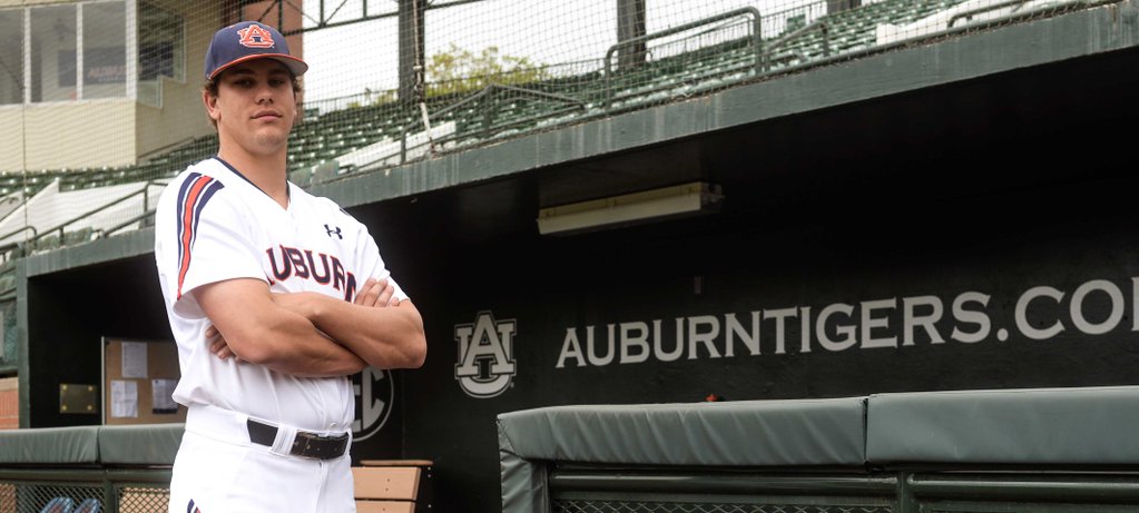
I can maybe stomach the completely out of place stripes on the jersey, even ignoring the fact that they aren’t the true Auburn stripes we’re used to, but why not stick with the exact stripes from the helmets or sleeves on the football uniforms? And then the pants…
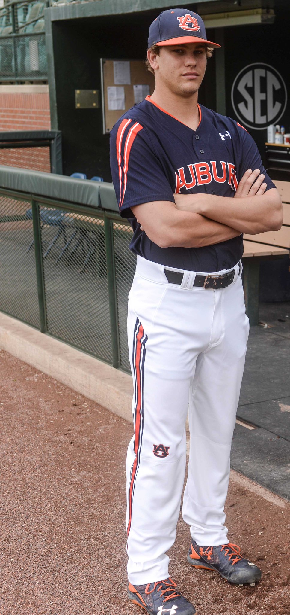 First off, why exactly don’t the stripes go all the way up to the hip? It’s like the football pants having a tapered stripe a few years back. And why are they, again, not the football stripes we know and love? And why is that random AU logo just sitting there on the knee?
I’m not even going to talk about the orange-based, out of place stripes on the blue jersey. Actually, yes I am. They are terrible. Every bit of it. It looks like a jersey you’d buy at Larry’s Kwik-Bait and Gas or something you’d find on the clearance rack at TJ Maxx.
I don’t really blame Auburn. I know Under Armour pushed these. And I know that baseball uniforms have gone the way of “ugly is somewhat funny and in a way is better” (see: Houston Astros Tequila Sunrise or anything from Adidas), but this is gross.
It’s not good just because it’s different. It doesn’t look good. Never again, Auburn. Never again.
1 comment
This reminds me too much of those crappy Red Sox uniforms of the 70’s. Hopefully UnderArmour is just floating these out to see how they are received and this will be a flash in the pan and the last we see of this. A repeat of what they tried with the football uniforms that thankfully reversed its course.