Yes, I’m writing a post about the fact that Auburn will wear the exact same uniforms as last year. It’s definitely news considering the small tweaks that have taken place the last few years, like the tapered pant stripe of 2011, the return of larger names and numbers of 2012, and the removal of the battle across the buttocks of 2013.
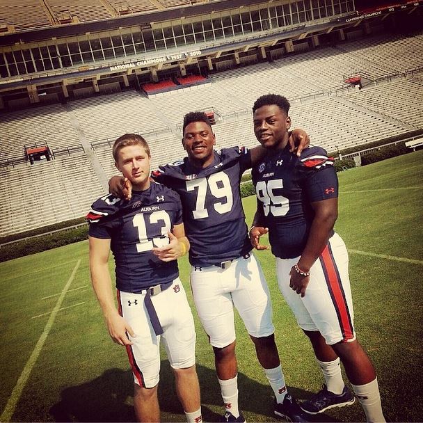
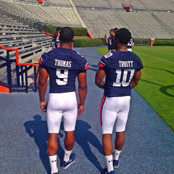
So yeah, for the first time since I really started paying attention to this stuff, there are no visual changes to the uniform from 2013 to 2014. The battle cry across the buttocks is still gone, and the pant stripe still tapers (don’t be fooled by #95 Dontavius Russell’s pants, look at #13 Sean White’s right knee below), and the names and numbers still appear to be close to the original size (as seen on Roc Thomas and Stanton Truitt further below), although nothing like pre-2011.
I saw the uniforms up close and personal over the weekend at Fan Day and can vouch. I saw no tweaks. Nothing.
Update: I have confirmed with Auburn that no tweaks were made this year.
I’m good with all of that, but I still want the pants stripe to go all the way down (I really want them to look like this). I want the names and numbers back to 2010 size, and I want the sleeve stripes to be more than a tiny little patch. Other than that, 2014 will be another year of the mostly-traditional.
1 comment
I’m glad to know I’m not the only one that has been obsessing–and disappointed–with the uniform the last couple of years. In my mind Under Armour took a great look in 2010 and really screwed it up. As a graphic designer, these changes have been very frustrating to me.
I can live with the current names, but the numbers are terrible. This is perhaps the primary design element of any uniform due to it being the largest and most visible. By making the numbers smaller, they aren’t nearly as legible from the stands–and isn’t that the point of having numbers?!
Where it is most noticeable is on the front of Marshall’s jersey. The much smaller “4” has a very small “counter” (the counter is the part of a letter or number that is the “unfilled” area–like the hole in a donut). On these small 4s, the counter is nearly filled in.
While I understand that there is a current trend of smaller numbers–I think even NIKE’s traditional schools have been reduced very slightly, I think Under Armour did a poor job with ours. The change was too dramatic and they left the thickness of the number a little too fat.
I’d like to see the 2010 numbers return or at the very least something so close to it that we’d likely not notice. As it is, Under Armour took a classic, traditional uniform and bastardized it.
Love listening to the al.com podcast, BTW.