Earlier today, I posted a picture that confirmed a few of the uniform rumors that had been floating around (‘War Eagle’ on belt line, stars on jerseys, etc.). One rumor, that began at Under Armour’s merchandise bus in Glendale, was that Under Armour would be adding white space between the pant stripes to look more like the helmet and jersey stripes. The aforementioned picture squashed that one like a 24-point lead in Tuscaloosa.
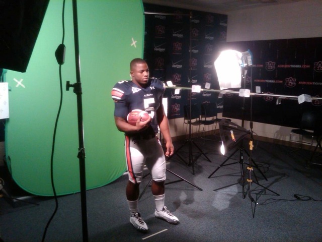
But as my friend Stephen A. Smith says… HOWEVA, a new and very strange change has been spotted in a picture that was tweeted by the Auburn Athletics Twitter account. Take a look at Michael Dyer’s knee. You know, the one that didn’t go down in the BCS National Championship Game. What’s up with his pants? Did they run out of fabric? They just need adjusting, right?
I thought this might be the case. I mean, it does somewhat look like his pants are just folded over or just got caught on something. But then someone sent me a link to a video from Auburn’s team picture day. Here are a few screenshots. The change is real.
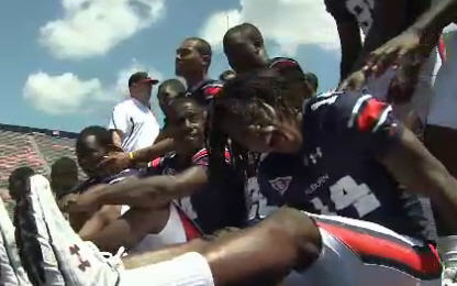
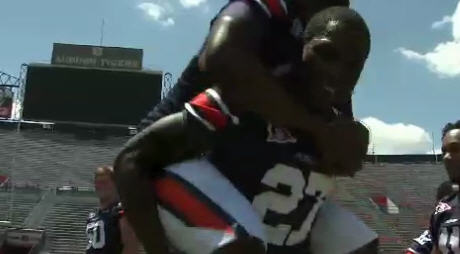
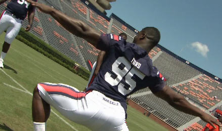
Alright, I’m going to try not to whine, but I don’t like it. I’d rather have the white space stripes. I don’t understand the whole coming to a point thing. And if I can get really technical, and I will, why doesn’t the blue stripe continue all the way to the bottom. It literally makes it look unfinished.
Update: To me it looks like the white area where the stripe should continue is a different type of fabric. This could be the reason for the change.
Update #2: Thanks to a little digging by one of the commenters, Brian Johnson, we have somewhat of an explanation for some the changes from Under Armour:
The material used to make the new football jerseys and pants is more stretchy, so less fabric is needed, said Adam Clement, senior on-field designer for Under Armour. Also the numbers are an inch or two smaller. Combined, they cut the weight of the jerseys by 20 percent, he said.
The new stretchy material is a little harder to get on and off.
Linemen will get some help with pants that have openings that stretch more easily over knee braces, said John Holschuh, Under Armour’s senior product manager. Before, teams cut pant legs to accommodate the bulky hardware. The pants also stretch more around the crotch so they don’t slide down when players crouch, he said.
Under Armour is breaking out a new belt buckle, replacing metal double D-shaped rings with a composite plastic clasp similar to that used on its backpacks that slips less and is lighter.
Oh well, they’re just pants. What do you think?
Thanks to @JoshuaBBlack for the initial heads up.
30 comments
I think they look like crap! I hope they are just pushed up in the pics cause when pants don’t come low enough on the knee neither do the pads in the pants ad that can lead to more injuries. WAR EAGLE ANYWAY!!!
Re: the pants, I’ll take a guess about the point at the knee. What if the old-style stripe material was causing irritation or blisters on the sides/back of the player’s knees? If that happened, the players would probably get the trainers to cut the pants to relieve the rub. Maybe the new design is an effort to keep the pants from binding. Again, it’s just a guess.
honestly i like none of the three evident changes: small names on back, war eagle on hind end, truncated stripes. we decide to make uni changes and this is what we come up with?
I agree with feline. I think all three, the war eagle on the butt, the incomplete stripe, and the smaller name, all look unbecoming of a storied program like Auburn. It’s like we are still trying to fight the Oregon/Nike battle.
i’m hoping these pants stripes are a one time only “pro combat” type thing. i guess that’s possible? please???
Personally, I think it looks pretty good, all of the changes. Except for the smaller name thing, that is pretty pointless, but I think it’s good to change it up every now and then! Besides, the new look cant hurt recruiting!
I dont care,as long as it’s AUburn! WAR DAMN EAGLE!!!!
Not a fan of the changes. Is there a move afoot to do away with the names altogether, a la Penn State? Taking the selfless Kodi Burns Team concept to the next level perhaps? Interesting but not a friendly concept to new fans, young fans, seniors and tracking numbers that don’t get retired. Who is that guy? It DOES sell programs though. The uniforms are classic. Don’t mess with a good thing. JMHO.
Give it a rest gramps. It’s just the last inch of the pants stripe. Maybe they’ll go with striped socks that attach there. It’s not a Pro Combat fight – it’s just a Uni adjustment. War Damn 21st Century National Champions Eagle!
I will whine. A uniform change is as much a corporate thing as a institutional change, it really falls on to how much change the institution is willing to take. Nike has done this for years in basketball; making a “System of Dress”, their words not mine, of cookie-cutter uniforms with the hopes that if enough teams wear them onlookers will not look at the uniforms as say a ‘Duke’ or a ‘Texas’ uniform, but rather as a ‘Nike Uniform’. Pro Combat is the next level.
And recruiting, re-shmooting: Auburn, Alabama, Oklahoma, Texas, and other traditional powers will get their fill on signing day even though they tend to abstain from change despite as all these new, BS advertising-jargon riddled “advancements” and still maintain some semblance of an identity (PS: If uniforms continue to become ‘20% lighter’, they will eventually weigh negative 4 lbs.) Meanwhile, teams like South Carolina or Maryland, whom have NO identity jump at the chance trot out a different looking team every year.
This time, it would appear that UA has found a way to pretty much force change on the school that might not even want to change, just like they have recently “innovated” a cleat that keeps players from having to tape their ankles like spats because when they did it covered the UA logo up. (Also why UA, Nike, and Reebok have all moved their logos to the toe of the shoe the past few years.) Auburn, SCAR, Texas Tech and Maryland are wearing the same cut of pants that have a a ridiculous leg panel that wraps around from the butt to the front of the knee as you can see from these pictures. SCAR and Maryland just have random, arbitrary piping that runs along the seams, same as they have every year a new cut is released, but Auburn’s pants on the other hand has simple vertical stripes and 50 years to deal with. UA is not going to make another set of pants to accommodate for uniforms such as Auburn’s nor are they going to go through the trouble of adding 3 inches of stripe on a separate panel. The images above are the result. Also lost in the pants leak, the cut of the jerseys aren’t doing the ever-disappearing sleeve stripes any favors either which from a design aspect helps make the nameplates look even smaller than they are.
Sorry for being so long-winded as I just realized how long this post it. But this one chaps me even if they are just pants. Here’s a shot from the EA team builder of Maryland’s uniform to get an idea of how whimsically these pants seemed to be put together, noting the wrap around striped panel right were Auburn’s stripe gets cut off.
Link didn’t go:
http://mix1065fm.radio.com/2011/07/05/take-a-peek-at-marylands-new-football-uniforms/
I like the small changes. The pants look good.
Oh, good grief. They’re pants. It’s not like we added a tiger striped trip to the jersey collars.
The truncated stripes are crap.
AUjamstan – Auburn never had names on regular season the jerseys until 1988 or so. (they had names on bowl jerseys because the players would get to keep them)
And people, I am sorry to tell you this but the belt line is not the butt.
Alex, thanks for not calling me “gramps” (hope to be one some day) and for the history lesson. If the name on the jersey goes away, it just means we have to study up. No big.
Apologies. I meant to say “gramps” in the sense of 1913 Auburn fans wanting us to play with logo-free helmets. If you were offended; I offer my humblest apologies.
I did some digging and here is what I found out about the 2011 iteration of the Under Armour-designed uniforms.
See below:
If lighter jerseys and no need to make adjustments for the linemen are the result of the stripe curving toward the front – I am ok with it.
Again, AUjamstan – your opinion is correct for you. I just differ and am willing to accept the change.
No worries, Brian. We both want our guys in better equipment (lighter weight, greater flexibility and efficiency) that improves performance, recruiting, morale etc. While in NYC for the Heisman ceremony, I recall LaMichael James remarking to Cam that he envied the functionality of UAs superior product (I think they were specifically discussing shoes). Blogle’s title of the post is “Changing the Tiger’s Stripe” and that’s a little different. Small changes in the look (tapered stripe, smaller names and numbers) repeated over time equals significant change and I personally prefer that we keep our classic look as it bonds us with the great Auburn teams, past, present and future. As CGC says, “this team was great before we got here”. Just my humble opinion. I’ll embrace whatever change that comes. War Eagle!
People who like it must think there is something wrong with the way they are .
They are wrong . Or it could be they are one of those folks that like change for the sake of change , and that’s just foolish . If it ain’t frik’n broke …………….
As long as the change was due to functionality improvements then I am all for it. but if it is to change the looks cause some idiot thinks they need changing then i am against it.
BTW if making the numbers and names smaller did lower the weight by 20%, then that was a smart move. I play adult soccer, and I definitely notice the weight of the numbers on my jersey… I wish I could do the same thing. Lets hope their numbers breath better than mine too. :D
WDE!!! 16 days 19 hours 54 minutes!!!!
Call me old fashioned but I wish they would have just left them alone.
-Devon
Speaking of Change…when #18 put it through the uprights on the 19 yard attempt; this is what I wanted to send all of Bammer relatives, co-workers, friends etc:
http://youtu.be/-aBmbUkkIGc
substitute Alabama for America
[…] with the rumors. Here we have the official uniform that Auburn will be wearing on their home field this season, as […]
PANTS STRIPE = DESECRATION OF BEST UNIFORMS IN FOOTBALL.
after seeing the new pants in game action, my resolve is strengthened…the new stripe may be only a minor amount of fabric missing…but in the look of the uni it is a MAJOR downgrade. they need to ditch that asap. hell it would look better if they’d have just cut the whole stripe shorter, instead of the “jagged edge” that looks like it could cut off a finger.
[…] this changing is if the complaints get loud enough. Hopefully Under Armour reads the comments on this post and was aware of the uproar on Twitter once Auburn fans saw the new uniforms. I hate these subtle […]
[…] Under Armour Did Change the Tigers' Stripes (8/11/11, Views: […]
[…] Under Armour Did Change the Tigers' Stripes (8/11/11, Views: […]
does it really matter what the jersey looks like? All that matter is the W’s. Only thing bad, small names…..they need to make them bigger. But I like the War Eagle on the back! JMHO
[…] changes” day. Try putting that on a t-shirt or flyer. Picture Day has brought us many surprises regarding uniforms in the past, let’s see what this year holds.The team took pictures this morning which meant that tweets […]